Role
Art Direction
Web Design
Objective
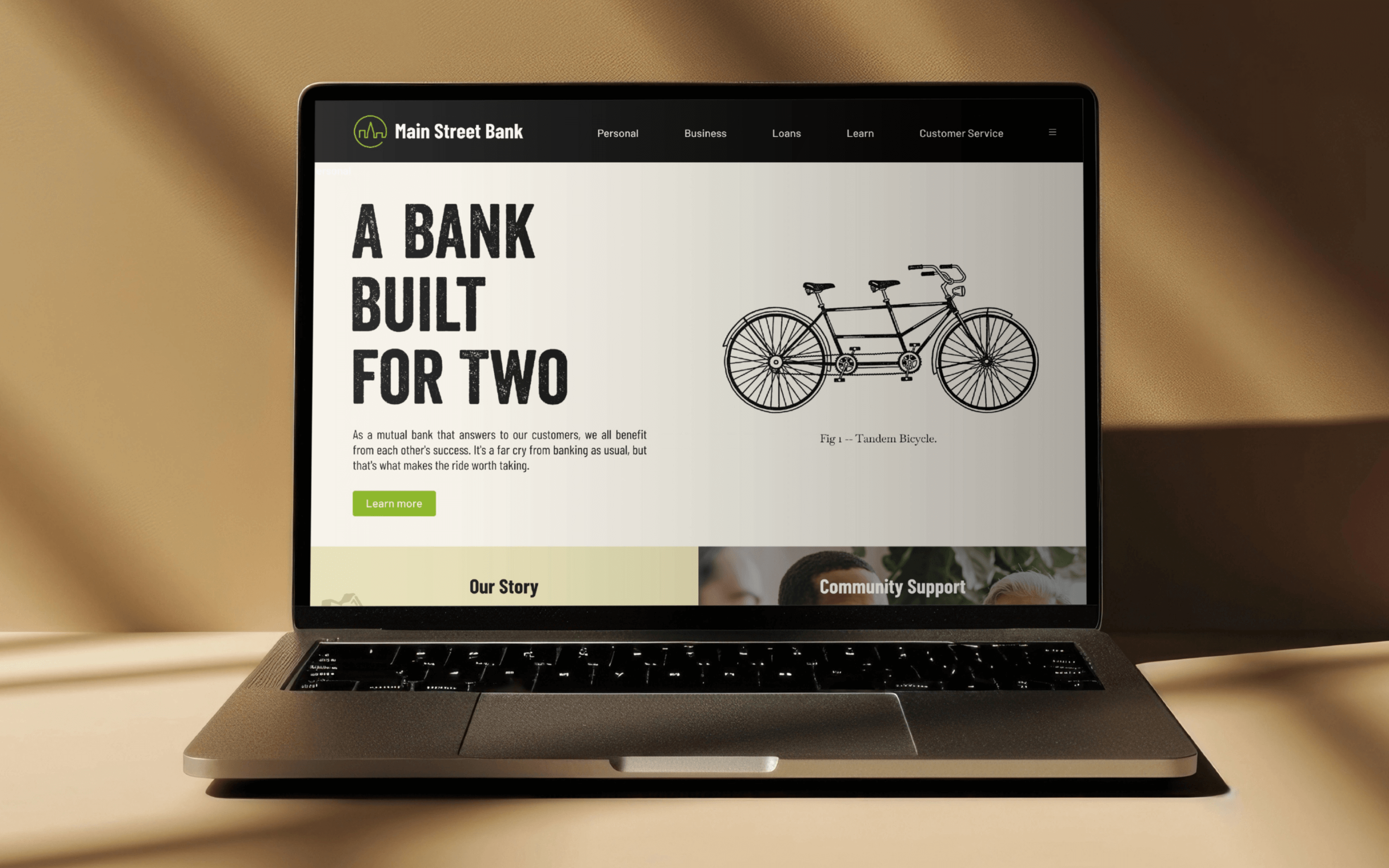
Formed by the merger of two regional banks with deep community ties, the newly branded Main Street Bank needed a campaign that honored its people-first roots. The goal was to reassure customers that this is still the bank where they can pick up the phone and speak to a real person, while introducing a modern brand backed by upgraded technology and expanded resources.
Approach
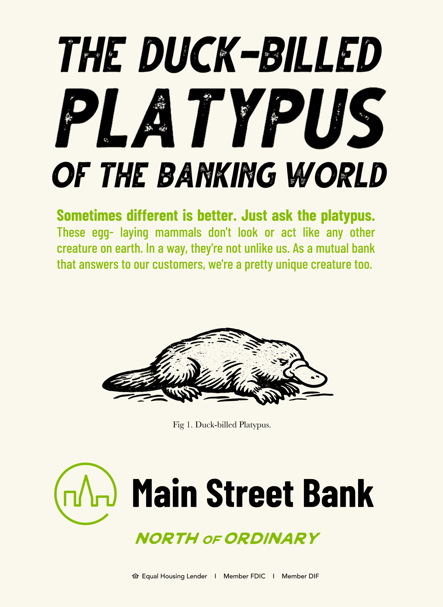
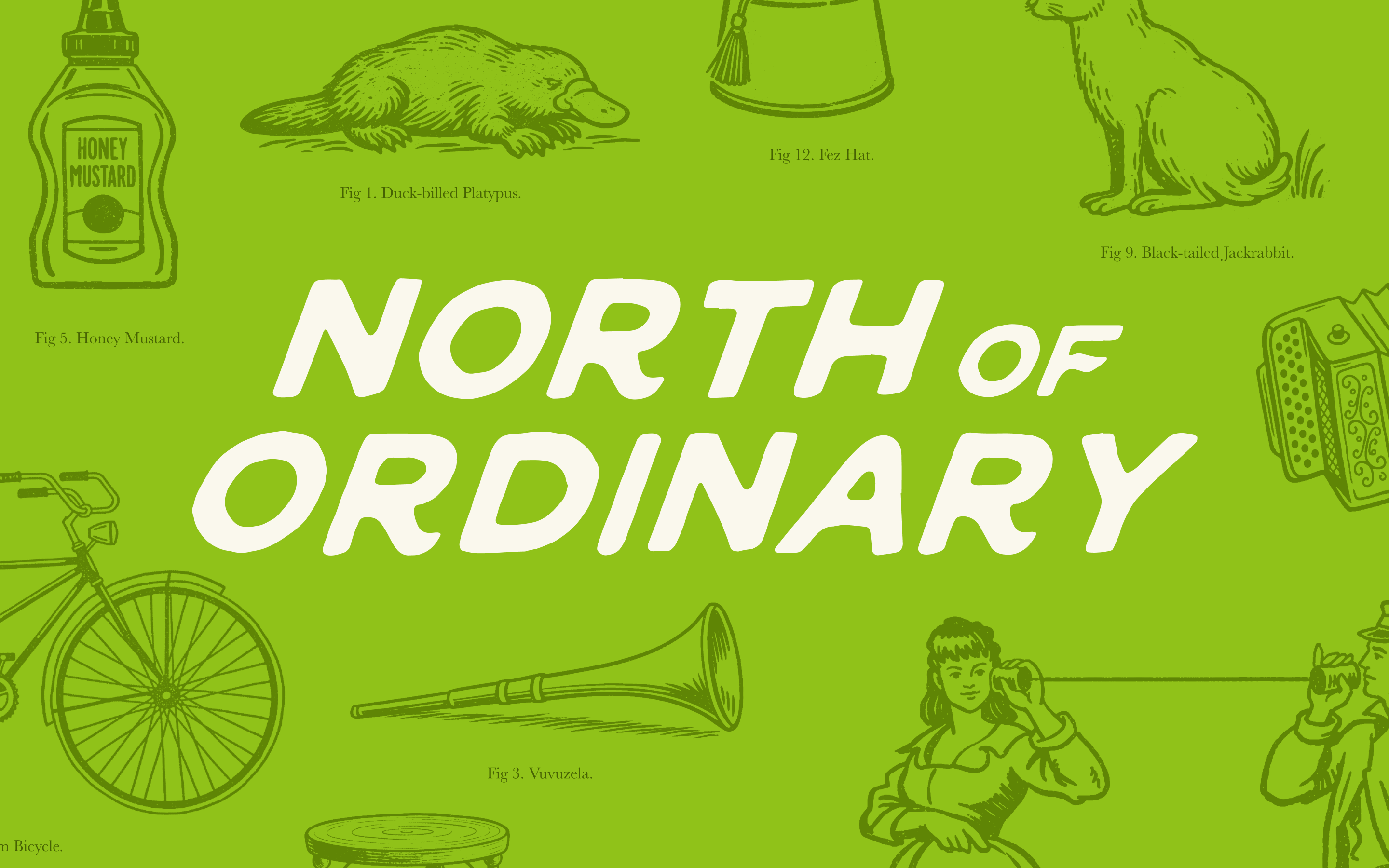
Banks that treat people like neighbors instead of numbers aren’t ordinary. That spirit fuels the campaign, which draws from the bank’s geography-inspired name, pairing vintage-inspired field-guide–style illustrations with a contemporary typography and color palette. The tone is honest and human, reflecting the way the bank shows up for its customers.
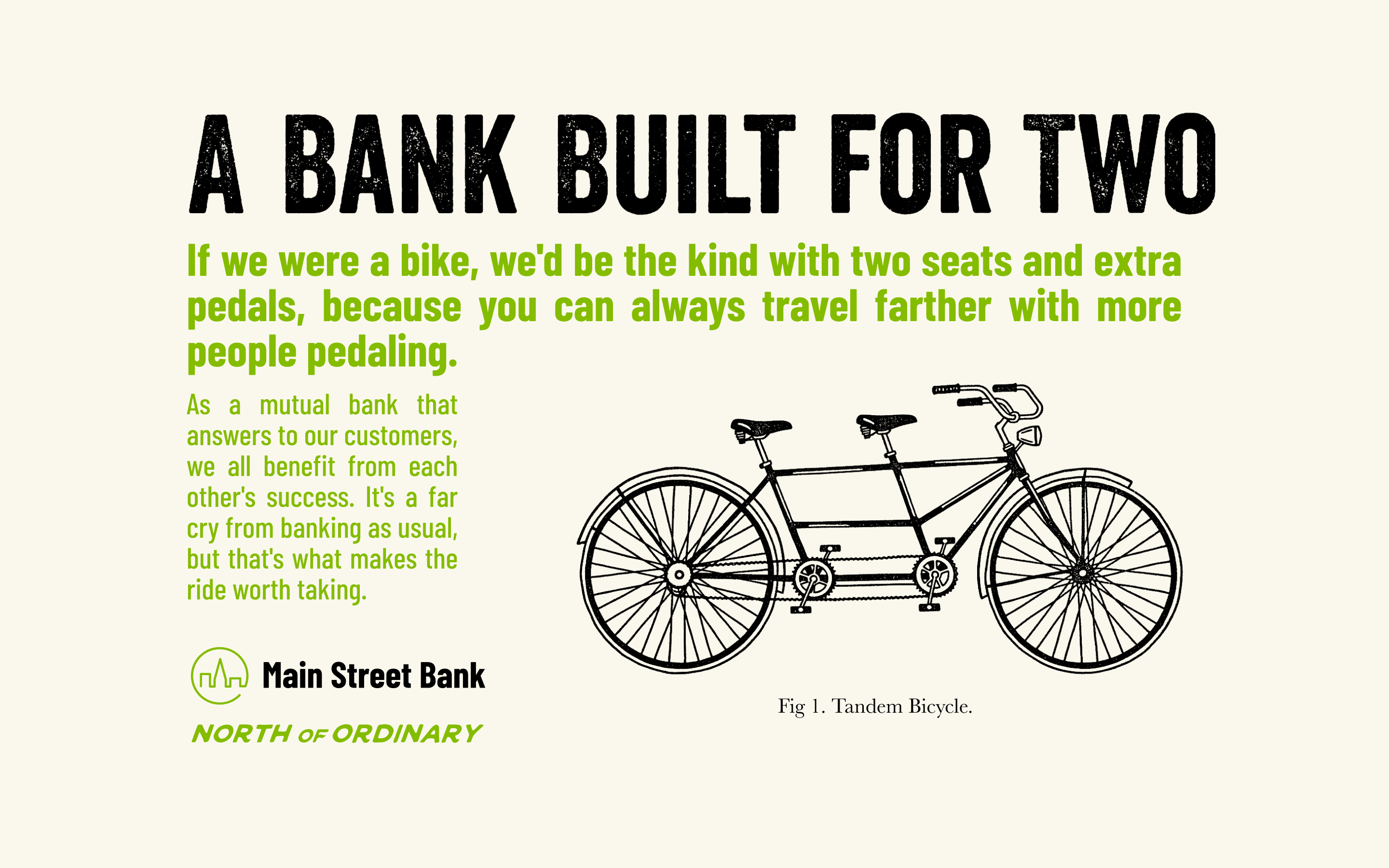
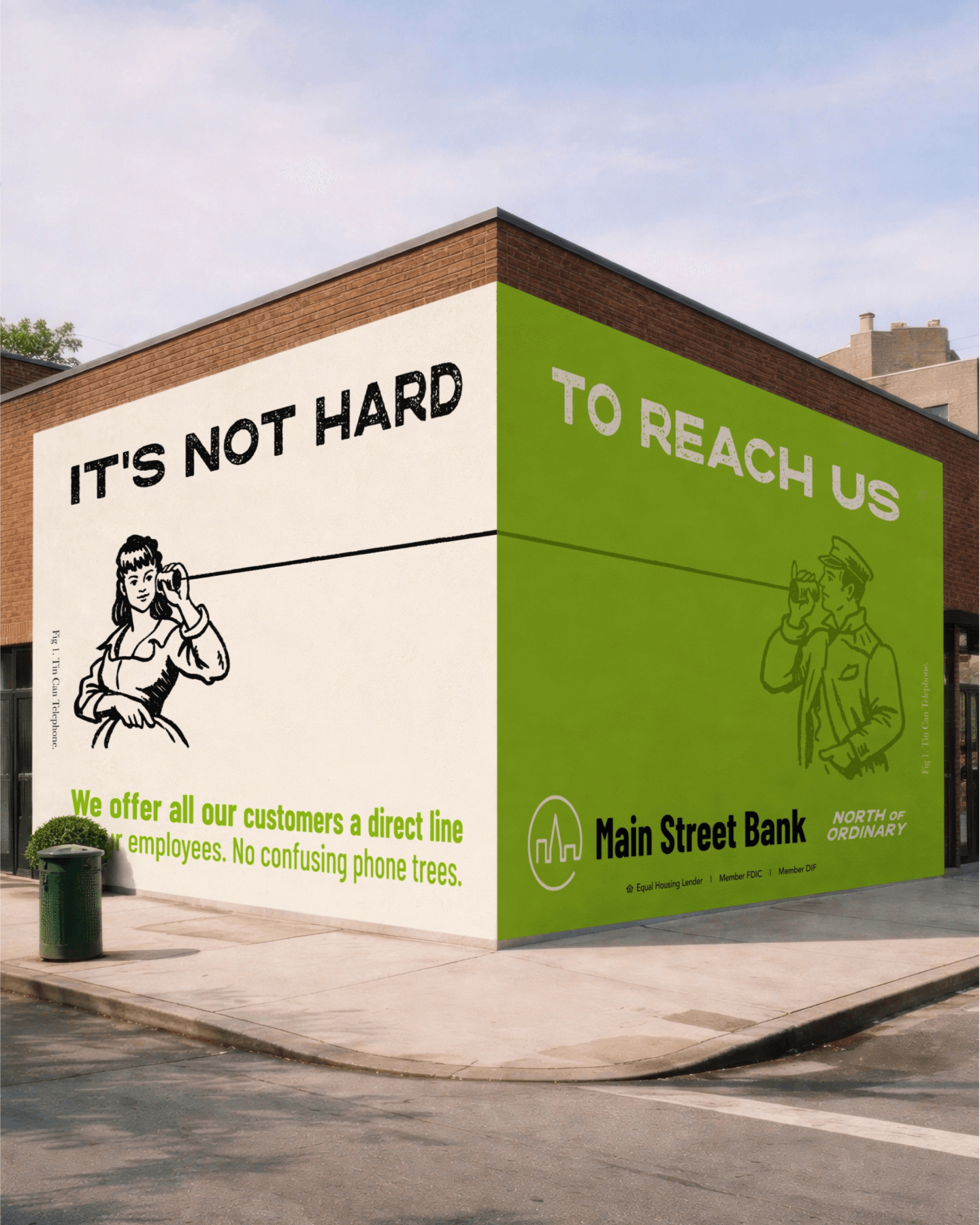
North of Ordinary


Recognition
Team
CD: Sam Pitino
ACD: Joe Krikava
ACD & Copywriter: Harry Kniznik